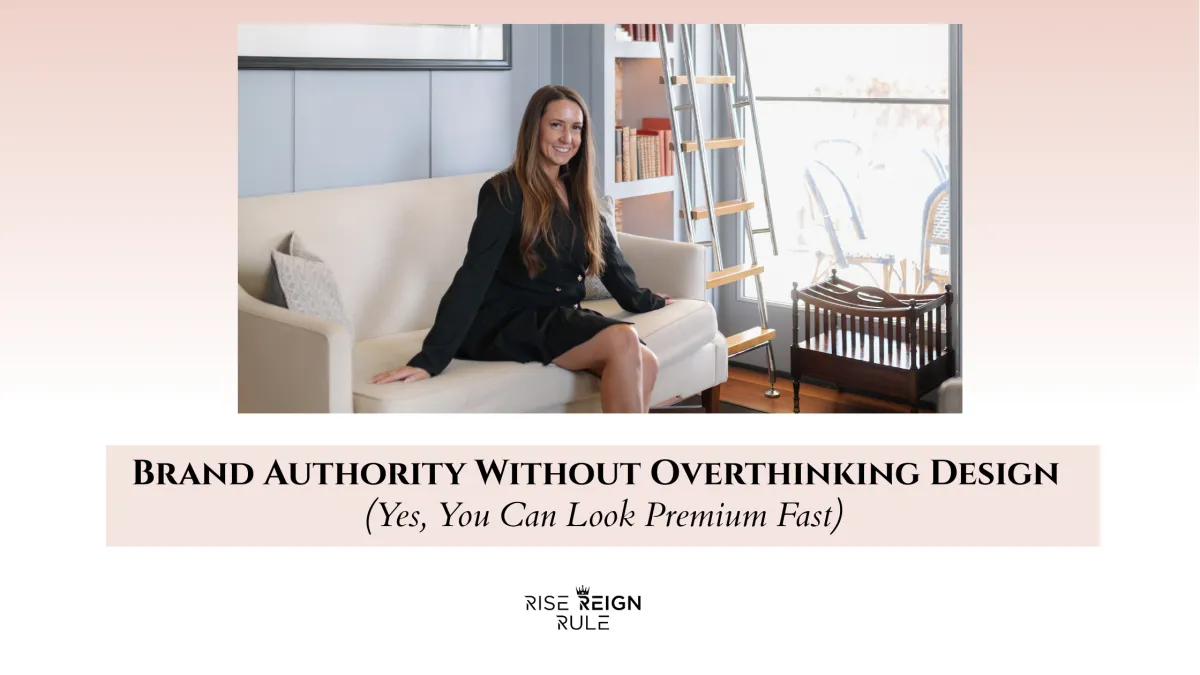
Brand Authority Without Overthinking Design (Yes, You Can Look Premium Fast)
Let me save you about 40 hours, three Canva spirals, and one identity crisis disguised as “brand refinement.”
Most women don’t have a design problem.
They have a clarity problem that they’re trying to solve with fonts.
Because here’s the truth nobody says out loud: premium is not a color palette. It’s a signal system.
A premium brand looks expensive fast when it communicates three things immediately:
Specificity (I know exactly who I help and what I do)
Standards (I don’t do chaos, and you can feel it)
Proof (I’ve done this before and it worked)
Design is the wrapper. Those are the ingredients.
So if you want brand authority without overthinking aesthetics, here’s the CEO shortcut.
The Premium Fast Formula
Premium = Positioning + Proof + Process (then polish)
If you nail the first three, the “look” becomes almost automatic.
Most people do it backwards:
polish → no positioning → no proof → confusion → “why isn’t this converting?”
We’re not doing that.
Step 1: Positioning That Sounds Like Money (Not a Personality)
Premium brands don’t say, “I help women step into their power.”
That’s lovely. It’s also non-purchasable.
Premium brands say:
who it’s for
what problem it solves
what outcome it creates
what makes it different
Use this one-liner:
“I help [specific person] achieve [specific outcome] using [specific method], so they can [clear benefit].”
Examples that feel premium fast:
“I help women-led clinics increase retention and cash flow with automation-led client journeys—without adding staff.”
“I help service-based founders turn inconsistent demand into predictable pipeline through outbound systems and follow-up.”
The more operational your language is, the more “expensive” you feel.
Step 2: Proof That Does the Heavy Lifting
The fastest way to look premium is to stop making people guess if you’re good.
Create a Proof Library and rotate it everywhere.
You need:
10 micro-wins (short, specific outcomes)
3–5 deep case studies (what you did + why it worked)
testimonials that mention results, not just “she’s amazing”
screenshots / metrics if appropriate
Premium proof is specific:
“In 21 days we rebuilt her follow-up system and increased booked calls by 38%.”
“We reduced no-shows by 26% with a reminder + confirmation sequence.”
“We lifted membership conversion by standardizing the sales script and automating nurture.”
A premium brand isn’t louder. It’s more substantiated.
Step 3: Process That Feels Like a Concierge Experience
This is the true premium hack: make your experience feel organized.
Luxury is predictability with warmth.
You don’t need a fancy logo. You need a clean client journey.
Minimum viable premium process:
a “Start Here” page
clear steps (what happens first, next, next)
boundaries in writing (response times, scope)
easy scheduling
clean payments
proactive check-ins
The moment someone feels “she has a system,” you look high-end.
Chaos is the only thing that looks cheap instantly.
Step 4: The Design Shortcuts That Actually Matter
Now we touch visuals—but we keep it ruthless and simple.
If you want to look premium fast, focus on restraint, not decoration.
Your “Premium Fast” Design Rules
Two fonts max. (One for headings, one for body)
Two neutrals + one accent max. (Don’t build a rainbow brand)
Whitespace is luxury. Stop filling every inch.
Consistent margins + spacing across everything.
Same photo treatment (lighting, vibe, cropping)
No clutter graphics. If it doesn’t clarify, remove it.
Premium brands look calm. They don’t look busy.
Step 5: The Three Places Premium Is Won (Without Design Perfection)
If you fix these three areas, your brand will feel elevated instantly—even if you change nothing else.
1) Your Bio / Headline
Make it crisp. Outcome-based. No poetry.
2) Your Offer Page
Use structure:
what it is
who it’s for
outcomes
what’s included
timeline
proof
FAQ
clear CTA
3) Your Onboarding Email
This is the first “luxury touch.”
A premium onboarding email feels like:
“Welcome. Here’s exactly what happens next. You’re in good hands.”
Not:
“Yay! Here’s a Google Drive link.”
The Auntie Truth: Premium Is Mostly Subtraction
Premium isn’t adding more.
It’s removing:
vague language
chaotic options
unclear CTAs
inconsistent visuals
needy energy
“let me explain my whole life” captions
The brands that look expensive are the ones that feel controlled.
Not rigid. Controlled.
Like a woman who knows what she’s doing.
The 48-Hour “Look Premium Fast” Checklist
If you want immediate lift, do these in two days:
Day 1
Rewrite your headline with outcome + method
Create 10 micro proof bullets
Tighten your CTA to ONE primary next step
Day 2
Build a “Start Here” onboarding page
Clean your offer page into a structured layout
Apply the design rules (fonts, colors, whitespace, consistency)
That’s it.
You’ll feel the difference instantly—because your brand will stop feeling like a vibe and start feeling like a system.
DOWNLOAD: The Canva Playbook
Edit, rebrand & design high‑value visuals in minutes.
